


")


 Tokens Playing This P2E Game")

A crypto rainbow chart was made for Bitcoin in 2014 to show how its price changed over time. Many Bitcoin investors have used this chart to forecast when the market would move into bullish or bearish territory.
The Bitcoin Rainbow Chart is a straightforward logarithmic regression graph that shows how the price of bitcoin has changed over time. The Bitcoin Rainbow Chart uses coloured bands to show potential buy, sell, and hold times for the cryptocurrency. Blue is the color of the rainbow’s lower bound, denoting a decrease in Bitcoin price, while red is the color of the rainbow’s upper bound, denoting an increase in Bitcoin pricing.
The Rainbow Chart is a tool for long-term Bitcoin valuation that offers an investor’s perspective on whether to purchase or sell Bitcoin based on the market sentiment that is highlighted at each rainbow color stage.
Why Is It Useful?
The regression lines are typically created on long time frames, despite the fact that the BTC Rainbow Chart is based on the most recent data and offers comparability of adoption rate, speed, and steady pricing in the future. They therefore don’t require frequent adjustment and is not reliable for short-term forecasts. The lower and upper market prices form the lines in a logarithmic regression chart. However, this method is particularly unreliable if the market price fluctuates in the center of these ranges.
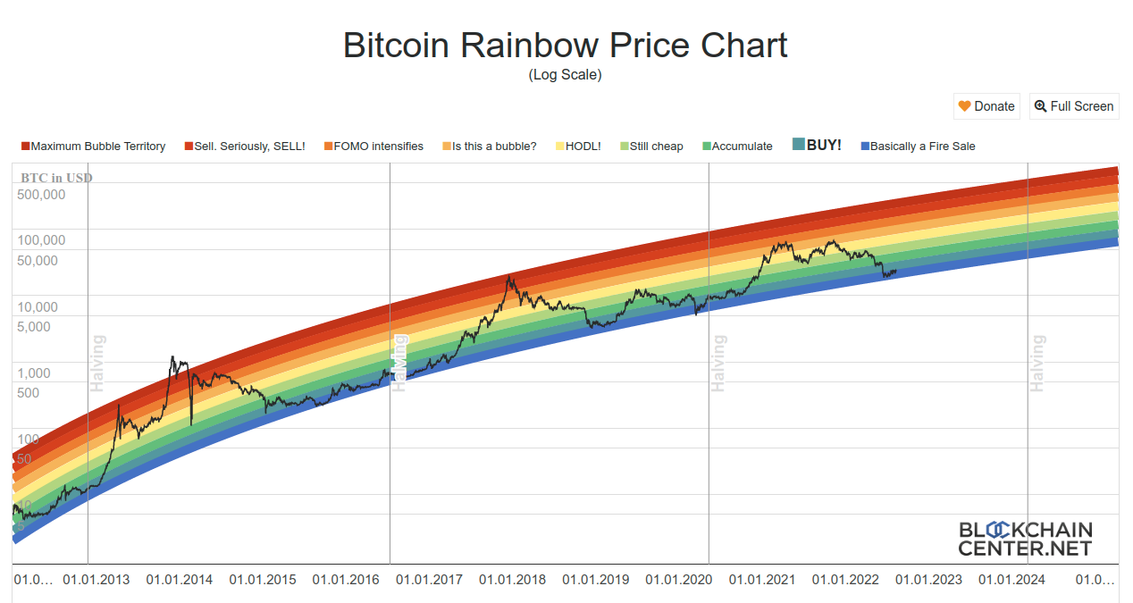 The Bitcoin Rainbow Chart has mainly been accurate throughout BTC’s history. There are nine distinct color bands on the Rainbow price chart, including:
- Blue: Basically a Fire Sale
- Bluish-Green: Buy zone
- Green: Cheap accumulate buy zone
- Light Green: Still cheap
- Yellow: Hold BTC
- Light Orange: Is this a bubble?
- Dark Orange: FOMO intensifies
- Red: Sell BTC
- Dark Red: Maximum bubble territory.
The good news is that the “basically a fire sale” phase of the Bitcoin rainbow chart has commenced. The Bitcoin rainbow chart’s “basically a fire sale” phase has started, which is good news. However, the reality is that finding a perfect method to decide whether to purchase or sell Bitcoin is virtually impossible. Since its creation in 2014, the Bitcoin rainbow chart has shown to be a useful tool for measuring market fluctuations and volatility, but it is not a predictor of future Bitcoin prices.
And for our best, freshest research on NFT buys, Layer 1 chains, DeFi, or games, come check out Altcoin Buzz Access. Plans start at only $99 per month
For more information on cryptocurrency, visit the Altcoin Buzz YouTube channel.
Images courtesy of TradingView.
Disclaimer
The information discussed by Altcoin Buzz is not financial advice. This is for educational and informational purposes only. Any information or strategies are thoughts and opinions relevant to accepted levels of risk tolerance of the writer/reviewers and their risk tolerance may be different than yours. We are not responsible for any losses that you may incur as a result of any investments directly or indirectly related to the information provided.
Do your own due diligence and rating before making any investments and consult your financial advisor. The researched information presented we believe to be correct and accurate however there is no guarantee or warranty as to the accuracy, timeliness, completeness. Bitcoin and other cryptocurrencies are high-risk investments so please do your due diligence. Copyright Altcoin Buzz Pte Ltd. All rights reserved.

