


")


 Tokens Playing This P2E Game")

A chart is a graphical representation of an asset’s price and volume fluctuations over time. A chart, or more particularly, a price chart, is the first tool that any trader who uses technical analysis must master.
Traders investigate price movement using technical analysis as a framework. According to the notion, a person can analyze past price movements to determine current trading conditions and probable price movement.The time period can range from a single day to a few months or longer. The X-axis(Horizontal line) shows the time period, while the Y-axis(Vertical line) depicts the price change in the graphical chart.
Types Of Charts:
Depending on the information they seek, technical analysts employ a number of charts. The most prevalent forms of charts, however, include the following.
Line Chart
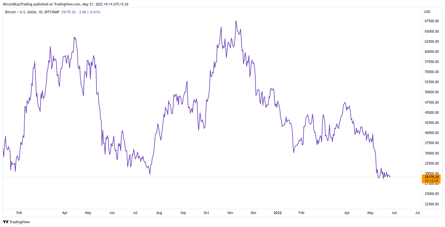
The line chart is the most common type of chart. This graph shows how the asset’s closing prices have changed throughout time. A simple line chart depicts a line drawn from one closing price to the next. A dot represents each closing price point. All of the connects forming lines to make the graphical representation.
Despite its simplicity (in comparison to other chart styles), a line chart can assist traders in recognising price movement trends. However, because it only records closing prices, it doesn’t provide any insight into intraday price changes.The X-axis in the chart below (BTC/USD) reflects the time period, while the Y-axis represents the BTC price.This chart is commonly used to provide a “big picture” view of price movements.
Bar charts
A line chart and a bar chart are pretty similar. It does, however, contain a lot more data. It shows highs and lows, opening and closing prices. Each plot point is represents a vertical line rather than a dot on the graph. On each side of this line, there are two horizontal lines.
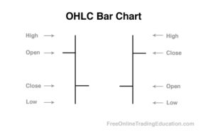
The highest price at which the asset traded during the day is shown by the top half of the vertical line.Similarly, the lower half displays the lowest traded price. The left extension indicates the asset’s opening price, while the right extension represents the day’s closing price.
Here is an example of a bar chart for BTC/USD:
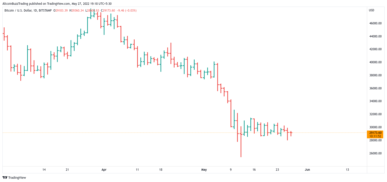
The main distinction between a line chart and a bar chart is that the latter can display volatility. If the line is longer, this indicates that the asset’s trading was more volatile. BTC/USD, for example, displays narrower lines, indicating lower volatility over the last few weeks. Because they show the Open, High, Low, and Close for a particular pair, bar charts are sometimes known as “OHLC” charts.
Candlestick Charts
Candlestick charts are a type of bar chart. Such charts provide the same price data in a more visually appealing manner. Among technical analysts, candlestick charts are extremely popular. They provide a lot of information in a clear and concise manner. Each day’s price movements are depicted in the shape of a candlestick, as the name suggests.
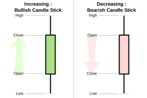
While bar charts only show volatility for a single trading day, candlestick charts can show volatility over a much longer length of time. Furthermore, depending on the price changes, the candlesticks come in a variety of colors. A rising candlestick has a white or green body, whereas a falling candlestick has a black or red body.
An example of a candlestick chart for BTC/USD:
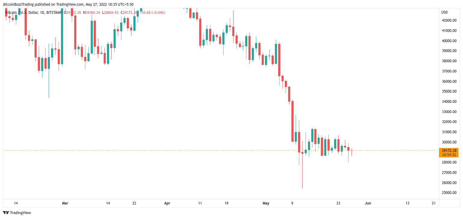
By presenting “bodies” in different colors, candlesticks assist in visualizing bullish or bearish sentiment. The candlestick would be green if the price closed higher than it started. The candlestick would be red if the price finished lower than it began.
Candlesticks identifies trading patterns. Patterns help the technical analyst set up a trade. Creating patterns is as simple as arranging two or more candles in a specific order. A single candlestick pattern, on the other hand, can sometimes identify powerful trading signals. Candlesticks and candlestick patterns have catchy names like “shooting star,” which makes it easier to recall what they imply. We will go into greater detail in the upcoming articles of the educational series.
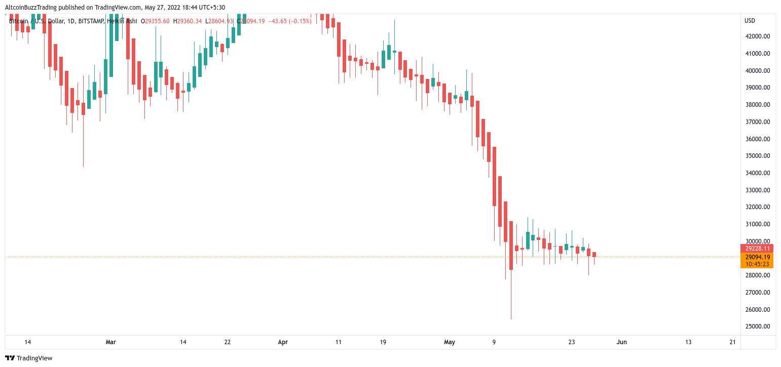
Heikin Ashi Charts
Heikin Ashi is a popular technical chart that resembles a candlestick chart and was developed in Japan. This chart clearly shows both the climb and the decline. When there are continuous green HA(Heikin Ashi) handles without a lower shadow, it indicates a strong trend. A significant decline, on the other hand, is indicated by continuous red handles without an upper shadow. Because the HA bars are averaged, there are no particular open and close prices for any given period.
Conclusion
The data is either information or noise in this case. It is critical for a trader to recognise that he must filter out information from the noise. Each chart will have its own set of benefits and drawbacks. For technical analysis, you can use any sort of chart or a combination of charts. It is entirely up to your particular preference.
For example, rather than looking at daily charts, a long-term investor should look at weekly or monthly charts to have a better understanding. The latter, on the other hand, would suffice for an intraday trader who just makes a few deals per day. High-frequency traders would benefit from the one-minute chart. In later lessons, you’ll learn how to use green and red candles to “see” things on the charts more quickly, such as uptrends and downtrends, as well as prospective reversal points.
And for our best, freshest research on NFT buys, Layer 1 chains, DeFi, or games, come check out Altcoin Buzz Access. Plans start at only $99 per month
For more information on cryptocurrency, visit the Altcoin Buzz YouTube channel.
Images courtesy of TradingView.
Disclaimer
The information discussed by Altcoin Buzz is not financial advice. This is for educational and informational purposes only. Any information or strategies are thoughts and opinions relevant to accepted levels of risk tolerance of the writer/reviewers and their risk tolerance may be different than yours. We are not responsible for any losses that you may incur as a result of any investments directly or indirectly related to the information provided.
Do your own due diligence and rating before making any investments and consult your financial advisor. The researched information presented we believe to be correct and accurate however there is no guarantee or warranty as to the accuracy, timeliness, completeness. Bitcoin and other cryptocurrencies are high-risk investments so please do your due diligence. Copyright Altcoin Buzz Pte Ltd. All rights reserved.

